Welcome to the Onshape forum! Ask questions and join in the discussions about everything Onshape.
First time visiting? Here are some places to start:- Looking for a certain topic? Check out the categories filter or use Search (upper right).
- Need support? Ask a question to our Community Support category.
- Please submit support tickets for bugs but you can request improvements in the Product Feedback category.
- Be respectful, on topic and if you see a problem, Flag it.
If you would like to contact our Community Manager personally, feel free to send a private message or an email.
Icon improvement sample
 MDesign
Member Posts: 1,341 PRO
MDesign
Member Posts: 1,341 PRO
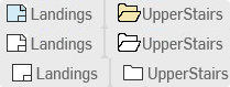
Not a new idea or discussion but I find that the icons for a drawing and a folder are too similar and find my eyes panning back and forth looking for a folder vs drawing at times. Here's a mockup of one idea that these could be improved upon and expanded on for other parts of the program. Original o the bottom. improved middle, super charged on top.
Don't get me wrong the mono tone of the icons make the whole program a unique look and are well done. not to mention they are colorblind friendly. maybe two modes could offer a solution to make icons easier to find while still offering the original look.
Comments
Looks good.
I don't think the top one is colourblind unfriendly as the shapes are just as iconic. For good readability (and best human factors practice) for everyone colour should never be the ONLY form of conveying information.
no it shouldn’t be an issue for color blind. Designing user interfaces with compassion for color challenged can be…. Well… challenging. There are varying levels of color difficiences. Some have red/green issues, some have blue issues, some just lack most color definition. So having the high contrast outline resolves that most of the time.