Welcome to the Onshape forum! Ask questions and join in the discussions about everything Onshape.
First time visiting? Here are some places to start:- Looking for a certain topic? Check out the categories filter or use Search (upper right).
- Need support? Ask a question to our Community Support category.
- Please submit support tickets for bugs but you can request improvements in the Product Feedback category.
- Be respectful, on topic and if you see a problem, Flag it.
If you would like to contact our Community Manager personally, feel free to send a private message or an email.
Looking for a dark theme? Here's how you can get one working using a browser extension (unofficial!)
My friend pointed out a dark theme extension for Chrome, Firefox, and Safari (webpage: https://darkreader.org/). It's good at converting light theme websites to dark theme ones. Surprisingly, it even works with Onshape! I added this to the config (under Dark Reader extension button > Dev tools) to make the icons more readable and dark theme-y:
Here are some screenshots with it active:
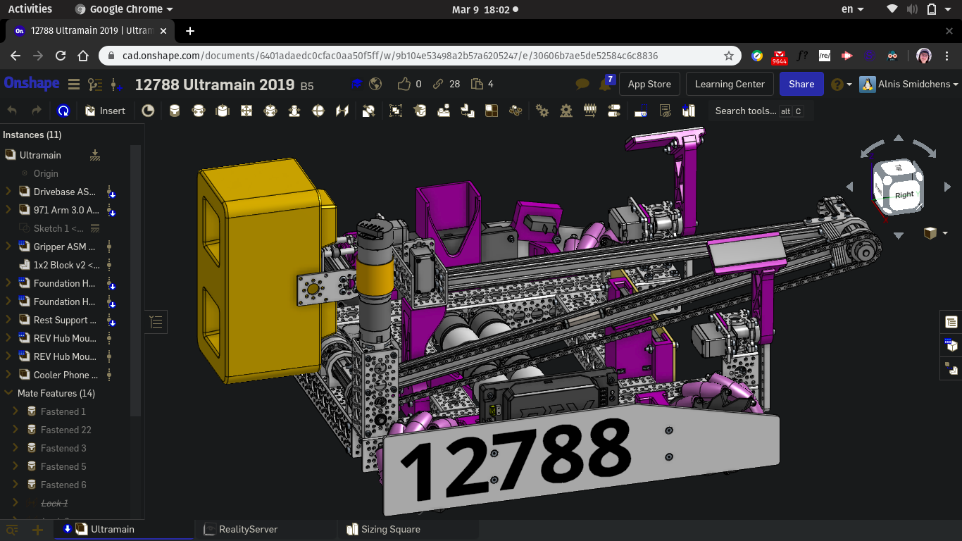
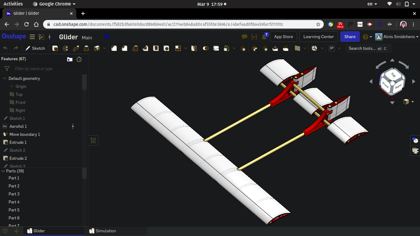
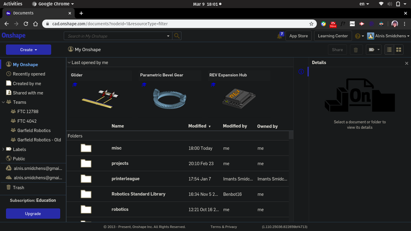
Of course, I'm not a developer or in any way affiliated with Onshape or Dark Reader, so use at your own risk!
================================

cad.onshape.com

INVERT
.os-svg-icon
.os-form-field-container

CSS
.os-svg-icon {
    filter: brightness(0.6) contrast(5) saturate(2) grayscale(.2) !important;
}

================================
It works very well with the documents page, part studios, feature studios, assemblies, etc. The only place where it really fails is in drawings (the drawing stays light and the icons are hard to see), but you can quickly toggle it on and off with Alt + Shift + D.Here are some screenshots with it active:


Of course, I'm not a developer or in any way affiliated with Onshape or Dark Reader, so use at your own risk!
Get in touch: contact@alnis.dev | My personal site: https://alnis.dev
@alnis is my personal account. @alnis_ptc is my official PTC account.
@alnis is my personal account. @alnis_ptc is my official PTC account.
4

Comments
@alnis is my personal account. @alnis_ptc is my official PTC account.
Twitter: @bradleysauln
Here are the settings I'm using in your modified code:
brightness(.7) contrast(5) saturate(.5) grayscale(.2)
RENDERCAD
rendercad.ai - Photorealistic product rendering.
▚▞▚▞▚▞▚▞▚
________________________________________________________________________
The newer versions of dark reader have per-site settings built into the the extension popup, so no need to edit the config. https://darkreader.org/help/en/#custom-site-settings
But now it looks like, well, crap
Could anyone help with fixing it?
(at the beggining it worked the same as for the OP but now everything it like, well, like in my screenshot and can barely see anything :c )
Buttons, icons, most text, parts and assemblies look fantastic:
Sketches in a part studio look great:
Also @marcin_dziony, I think you need to change Dark Reader from Filter, Filter+ or Static to Dynamic for it to look like mine or Alnis' screenshots.