Welcome to the Onshape forum! Ask questions and join in the discussions about everything Onshape.
First time visiting? Here are some places to start:- Looking for a certain topic? Check out the categories filter or use Search (upper right).
- Need support? Ask a question to our Community Support category.
- Please submit support tickets for bugs but you can request improvements in the Product Feedback category.
- Be respectful, on topic and if you see a problem, Flag it.
If you would like to contact our Community Manager personally, feel free to send a private message or an email.
Any work around method to insert radial text in sketch
 viru
Member, Developers Posts: 619 ✭✭✭✭
Hi,
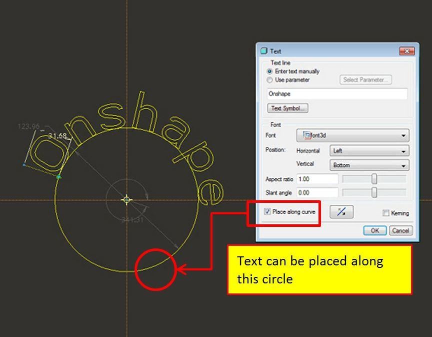
Many products contain the text in radial direction such as round rubber stamps, coins, Ball bearing faces, sheet metal and cast parts etc. So, with the availability of provision of radial text, user can design such parts easily. Can anyone suggest any workaround to insert radial text in Onshape. Below image show the option available in text option of Pro-E.

With warm regards,
viru
Many products contain the text in radial direction such as round rubber stamps, coins, Ball bearing faces, sheet metal and cast parts etc. So, with the availability of provision of radial text, user can design such parts easily. Can anyone suggest any workaround to insert radial text in Onshape. Below image show the option available in text option of Pro-E.

With warm regards,
viru
1
Best Answer
-
 andrew_troup
Member, Mentor Posts: 1,585 ✭✭✭✭✭
I tried out @pete_yodis suggestion - I thought it might be easier to make an underlying circular pattern of parts, namely triangular placeholders (simple extrudes of a triangle sketch) and snap two of the points defining the height and the angle of each letter to the endpoints of the vertical side of the triangle. However the equal-angle spacing which resulted is not actually typographically sound, as seen here:
So ... a simpler way turned out to be to forget about placeholder parts, and start again, drawing individual single letters, and making them equal in height using an equal constraint on one of the vertical lines of the bounding rectangle, dimensioning one (100).
It does not work to make the widths equal, as different letters have different aspect ratios (height/width)
All letters were created in the same sketch, under tab "Letter layout" in this public model:
https://cad.onshape.com/documents/cdd5528b9e1449edbe45cf67/w/7f890a6ea5b748e8ab74c7e2/e/0b0c316cbe32435382638f74
Then I drew a radiating set of lines starting from the origin, and made them equal in length, dimensioning one (300). I deleted the horizontal constraints which are generated automatically when each individual letter is first drawn, and snapped the bottom midpoint of each letter to the end of a radial line.
The top midpoint was made coincident with the same line (so it would lie on a notional extension of it) which lined the letters up with the radial lines. It was now simply a matter of dragging each letter to a suitable angle, judged by eye, and 'fixing' each corresponding radial line in turn. No further dimensioning was required.
It's laborious but not difficult, for a short string of text. The sketch can be copied and pasted into other parts or documents, say for a logo.
7
Answers
So ... a simpler way turned out to be to forget about placeholder parts, and start again, drawing individual single letters, and making them equal in height using an equal constraint on one of the vertical lines of the bounding rectangle, dimensioning one (100).
It does not work to make the widths equal, as different letters have different aspect ratios (height/width)
All letters were created in the same sketch, under tab "Letter layout" in this public model:
https://cad.onshape.com/documents/cdd5528b9e1449edbe45cf67/w/7f890a6ea5b748e8ab74c7e2/e/0b0c316cbe32435382638f74
Then I drew a radiating set of lines starting from the origin, and made them equal in length, dimensioning one (300). I deleted the horizontal constraints which are generated automatically when each individual letter is first drawn, and snapped the bottom midpoint of each letter to the end of a radial line.
The top midpoint was made coincident with the same line (so it would lie on a notional extension of it) which lined the letters up with the radial lines. It was now simply a matter of dragging each letter to a suitable angle, judged by eye, and 'fixing' each corresponding radial line in turn. No further dimensioning was required.
It's laborious but not difficult, for a short string of text. The sketch can be copied and pasted into other parts or documents, say for a logo.
Text functionality should be improved by following a 2d curve or curved surface or both.
Twitter: @onshapetricks & @babart1977
You're right, it's tedious if all the letters need to be edited. If it's a sequence of part numbers, I guess it's marginally do-able, because only one or two digits would require replacement in many cases. (It's still quicker and easier than engraving part numbers with a toolmaker's pantograph!)
I guess it's not usually essential that part numbers be 'bent', but if they were:
I would definitely use viru's method rather than mine in this case, as it would permit sizing the replacement letter simply by snapping. One snap from the midpoint of the baseline to the intersection of the radial line with the base circle, one snap from the midpoint of the topline to the top circle.
To fix the orientation angle would however still require a (coincident) constraint between the latter midpoint and the radial line.
Twitter: @onshapetricks & @babart1977