Welcome to the Onshape forum! Ask questions and join in the discussions about everything Onshape.
First time visiting? Here are some places to start:- Looking for a certain topic? Check out the categories filter or use Search (upper right).
- Need support? Ask a question to our Community Support category.
- Please submit support tickets for bugs but you can request improvements in the Product Feedback category.
- Be respectful, on topic and if you see a problem, Flag it.
If you would like to contact our Community Manager personally, feel free to send a private message or an email.
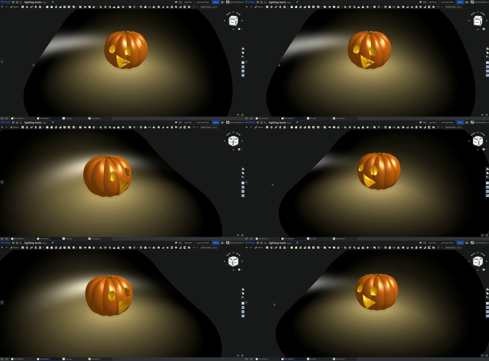
Work in progress - fake lighting for a pumpkin project
I'm currently working on faking some lighting for a pumpkin modeling project, and I figured I should share my progress along the way.
Right now, I'm trying to get the lighting to look good, and then I'll work on a more generalized solution for all sorts of lit backgrounds and objects. Hopefully, I'll eventually turn it into a custom feature once I'm done (it's currently just a bunch of patterned variables and other features). The light falloff is currently linear since I was having trouble getting an inverse square falloff to look good. I think that the end solution will be to have an inverse square falloff from lighting sources, but also a final logarithmic transformation of the color to get it to look good and enhance the dynamic range of the image. That will make the coloring behave more like a typical 3D rendering engine, camera, or human eye.
In any case, without further ado, here is a first gif of the scene (everything is WIP, the final will look much better):

As I've been working on this, I realized it would be nice to have a "flat" view mode where simply solid colors are displayed (no specularity). This would add some extra artistic freedom, and it would also give another option when taking screenshots for documentation and/or printing (something between an edges-only view and a shaded view), maybe like this mockup I made in Blender:

Right now, I'm trying to get the lighting to look good, and then I'll work on a more generalized solution for all sorts of lit backgrounds and objects. Hopefully, I'll eventually turn it into a custom feature once I'm done (it's currently just a bunch of patterned variables and other features). The light falloff is currently linear since I was having trouble getting an inverse square falloff to look good. I think that the end solution will be to have an inverse square falloff from lighting sources, but also a final logarithmic transformation of the color to get it to look good and enhance the dynamic range of the image. That will make the coloring behave more like a typical 3D rendering engine, camera, or human eye.
In any case, without further ado, here is a first gif of the scene (everything is WIP, the final will look much better):

As I've been working on this, I realized it would be nice to have a "flat" view mode where simply solid colors are displayed (no specularity). This would add some extra artistic freedom, and it would also give another option when taking screenshots for documentation and/or printing (something between an edges-only view and a shaded view), maybe like this mockup I made in Blender:

Get in touch: contact@alnis.dev | My personal site: https://alnis.dev
@alnis is my personal account. @alnis_ptc is my official PTC account.
@alnis is my personal account. @alnis_ptc is my official PTC account.
6

Comments
what's going on here? looks like some awesome craziness!
The Onsherpa | Reach peak Onshape productivity
www.theonsherpa.com
@alnis is my personal account. @alnis_ptc is my official PTC account.
The Onsherpa | Reach peak Onshape productivity
www.theonsherpa.com
@alnis is my personal account. @alnis_ptc is my official PTC account.
@alnis is my personal account. @alnis_ptc is my official PTC account.
@mahir this lighting workflow is certainly of dubious utility, and given that Alnis made this animation, it strikes me as a curious passion project or quarantine insanity, to which I say shine on you crazy diamond!
The Onsherpa | Reach peak Onshape productivity
www.theonsherpa.com
I figured it would be a fun project to figure out how to have the different depths of cut have different face colors to simulate that sort of glow, so I decided to start with some simpler lighting projects and then move up in scale/difficulty. Hopefully, I'll eventually write a custom feature to help automate some of it, but first, I need to just get it working in a regular model!
@alnis is my personal account. @alnis_ptc is my official PTC account.
On the other hand, maybe you could just modify the extrude feature so that it also colors the end cap faces according to depth as a % of the total substrate thickness. Then you could make the art in some vector software and import a dxf as your base sketch.
The Onsherpa | Reach peak Onshape productivity
www.theonsherpa.com