Welcome to the Onshape forum! Ask questions and join in the discussions about everything Onshape.
First time visiting? Here are some places to start:- Looking for a certain topic? Check out the categories filter or use Search (upper right).
- Need support? Ask a question to our Community Support category.
- Please submit support tickets for bugs but you can request improvements in the Product Feedback category.
- Be respectful, on topic and if you see a problem, Flag it.
If you would like to contact our Community Manager personally, feel free to send a private message or an email.
Combine Assembly Cylindrical & Revolute Mates into One Mate
 Don_Van_Zile
Member Posts: 195 PRO
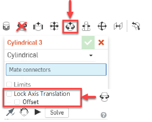
The Assembly mates in Onshape seemingly take new users a bit of getting used to (confusing) from my experience so far with our team coming from other systems; questions about how to define something or errors and how to fix. For example, when to use Cylindrical verses Revolute Mates. When you have many linkages to parts Cylindrical mates are your friend because they leave the axis translation degree of freedom open when it's already defined (locked down) by another mate.
I'm wondering if it might be better to simply combine the Revolute Mate within the Cylindrical Mate UI/Function as shown below thus eliminating Revolute from the tool bar. The options added boxed in red would lock down the Cylindrical Mates Translation. When this option is used the Feature List icon could still reflect the different Icon for the visual feedback. I think making these two mates one to the user might be easier to understand.

The same could be said about the In-Plane and Parallel mates being combined into one within its options. I noticed a common question among our users as to how to apply a Coincident mate between two faces and wasn't sure to use In-Plane or Parallel. You could use either such as Parallel with a 0 for Z's and it's confusing to them.
Just thought I would throw this out there for any potential discussion. Is anyone else running into confusion with these mates?
1
Comments
HWM-Water Ltd
Don
So once we get more control over customizing the UI, you could probably select what ever you wan't to show or just have one icon for mates and select from dropdown.
HWM-Water Ltd
That was the point I was about to make as well, It really isn't much different hitting a checkbox or switching a mate type in the drop down.
Although I would not agree with one icon for mates and using a drop down every time. The reason is it doubles the click count for each mate.
1-mate icon
2-MC 1
3-MC 2
1-mate icon
2-dropdown expand
3-mate type select
4-MC 1
5-MC 2
Although Instead of the dropdown menu, it would be nice if it were a grid of mate icons.
There are not that many mate types, and the visual people like myself can spot the difference between the Revolute mate and the Cylindrical mate by examining the Icon.
Having a nice 2x4 grid would be much easier to spot your mate if you have a spacial awareness type of mind and can find your mate type by where it appears in the 2x4 grid.
(This is how I find hole types in solidworks hole wizard very quickly)
Not only that, the drop down menu isn't in any particular order that I can tell.
It's not sorted by degerees of freedom, alphabetical, character length, shape of the icon image, or even the same order as they would appear on the top toolbar.
Are they just randomly added to the list as the programmer could remember them or what